If your organization’s mission is rooted in equity, your website is a good place to show it. An accessible website simply means that everyone can use it—including our neighbors who are blind, folks who don’t use a mouse, or people who are deaf or hard of hearing. An update from the Department of Justice recently extended the compliance dates for most groups for web content and mobile applications. Accessibility isn’t about trying to get things perfect overnight. It’s about stewardship—making sure the digital front door of your community service is unlocked for everyone. With this bit of extra time, here are some practical places where we have been trying to get better.
Words, colors, and images
Focus on what people see and read when they first land on your pages.
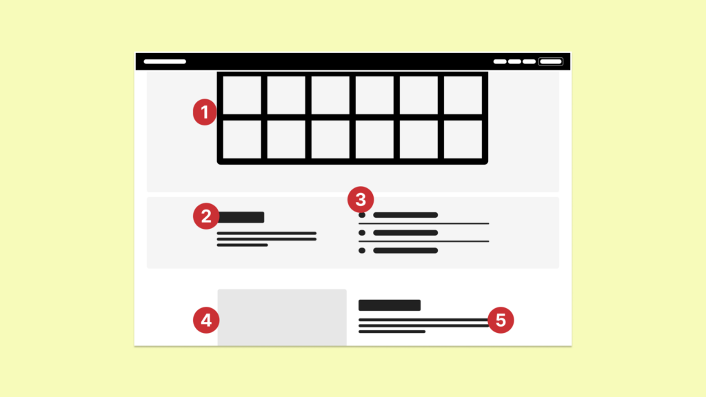
- Use high-contrast colors: Dark text on light backgrounds will ensure your message is easy on the eyes and readable for everyone, but whatever your choice there are plenty of tools to check color contrast choices.
- Keep headings organized and clear: Use simple, descriptive headings to break up long blocks of text, making it easier for people to scan the page and find the help they need. Keep headings in a natural order and structured so the page is easy to skim for screen readers and search engines to understand, ie H1, H2, H3, H4, etc. Don’t jump from a major heading (H2) to a small heading (H4).
- Mark redundant icons as decorative: If an icon is right next to a text label that already explains what it is, use an empty alt tag so screen readers don’t repeat the information twice. Or if it is there purely for decoration (like a background pattern or divider line), mark it as such so screen readers can skip past it.
- Describe images: Add alt tags to any images that carry information so everyone understands the story they are telling. Focus on the main point of the image. Don’t start with “Image of…”—just describe what matters. Write descriptions based on why the image is on the page. Deque has a good article on what goes into writing these tags.
- Write in plain language: Use plain, everyday words and short sentences. Avoid overly technical terms or jargon to make it your mission easier to understand for our neighbors who are in a hurry or stressed. The Nielsen Norman Group has good research that this benefits everyone too.
PDFs and videos
Don’t forget to evaluate PDFs and videos as they can often be hurdles for people using assistive technology.
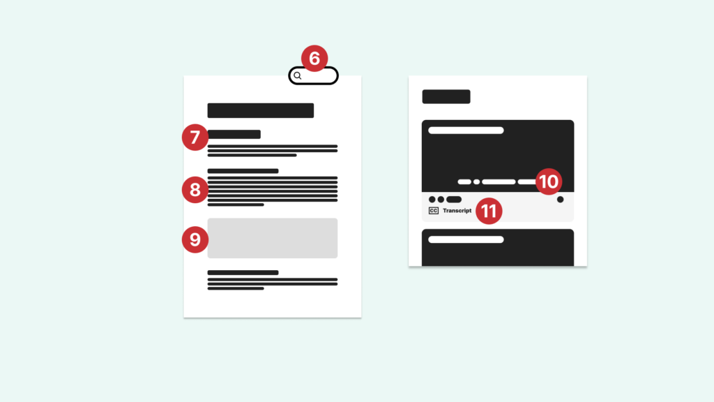
- Make PDFs searchable. Add notes here… document rather than just a scanned image which screen readers can’t “read.”
- Structure your PDFs: Just like a webpage, a PDF needs a sturdy “skeleton” of semantically organized headings (H1, H2, H3, etc.)
- Check document contrast: Accessibility doesn’t stop at the webpage. Ensure the text inside your shared docs or PDFs is high-contrast and easy to read against the background.
- Alt text for images. Add details
- Check caption accuracy: Ensure media like videos has clear, accurate captions.
- Provide written transcripts. For more complex visuals, consider providing a short written transcript or audio description so no one misses the core message of your story.
Navigation and forms
Make sure your forms and site are reliable for people navigating with a keyboard rather than a mouse.
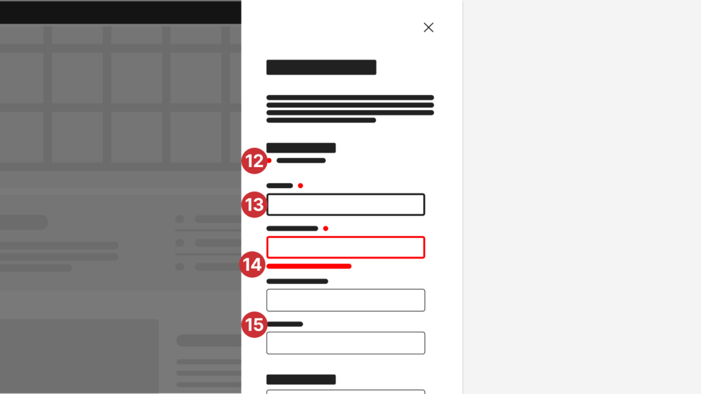
- Clearly indicate required fields: If you use an asterisk (*) to show a field is mandatory, make sure you include a short note at the top of the form explaining that “fields marked with an asterisk are required.” This ensures everyone, including those using screen readers, understands the requirement before they start typing.
- Provide a visual anchor: When people move through your site using the “Tab” key, they need to see where they are. Ensure a clear “focus ring” or border appears around buttons and links as they are selected—it’s like a spotlight for their cursor. W3C provides examples of why this matters.
- Avoid color-only cues: Never use color as the only way to share information, such as a red box that doesn’t also include a clear text warning. Use helpful text messages like “Please enter your email address”. Color alone isn’t a clear enough signal for everyone.
- Label forms prominently and clearly: Put a permanent label above every input box. Don’t rely on “placeholder text” inside the box that disappears when someone starts typing. It’s easy for people to lose their place or forget what they were supposed to enter.
By taking these steps, you’re making sure your organization is truly open to every person in your community. If you need a hand figuring out where to start, we’re here to help.