Upper Valley Equity & Anti-Racism (UVEAR)
Design Allies partnered with UVEAR to design and launch a new Squarespace website to for BIPOC community members in the region.
CAUSE
Civil Rights & Advocacy
ROLE
Research & Strategy
Design & Build
TOOLS
Google Workspace
Notion
Figma
Squarespace
DURATION
2 weeks
✦✦✦
“When we brought ambitious ideas to the table, rather than telling us they were too much, Design Allies asked, ‘What can we do to get an MVP going?’ They researched alternatives, found workable solutions, and helped us think about how these features could evolve.”
Charles Peoples III
Health Equity Program Coordinator
Public Health Council of the Upper Valley
Upper Valley Equity & Anti-Racism Group
Business challenge solved
As a new project, UVEAR needed a dedicated digital home to showcase its critical initiatives, community resources, and public programs. To build long-term sustainability and maximize regional visibility, the organization needed a strong foundation to build on, with intuitive navigation and designed to support third-party integrations and features for the future.
PROJECT GOALS

Centralize community resources by bringing together the BIPOC historical timeline, public event calendar, and core community programs into single, organized destination.

Expand local visibility for BIPOC leaders across rural New Hampshire and Vermont with a dedicated digital platform designed to foster networking and economic support.

Streamline community engagement through clear, accessible paths to raise program awareness and capture ongoing interest via outreach and newsletter subscriptions.
Scope of work
Discovery
- Site map and navigation structure review
- Database and timeline plugin research
- Established Slack & Figma workflows
Design
- Update type styles
- Mapped Squarespace color theme to align with brand guidelines
- Update key patterns for forms, buttons and misc elements
- Drafted site wireframes/layout templates
Development
- Build initial site architecture in Squarespace
- Update styles to align with WCAG 2.1 AA criteria
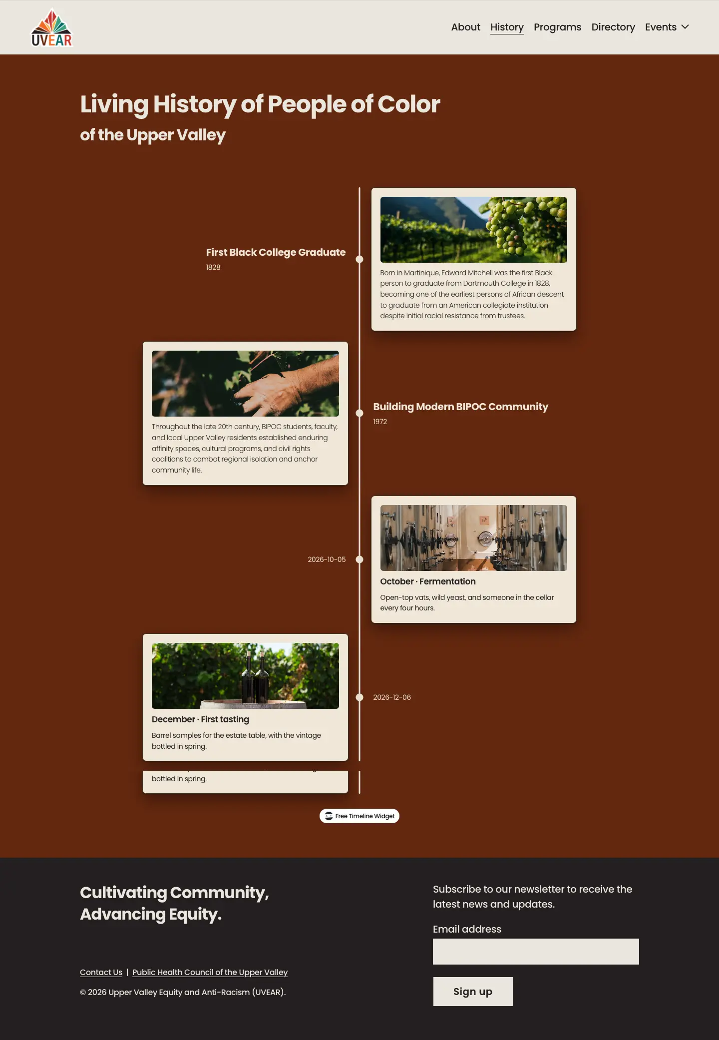
- Integrate and style history and event calendar framework
- Test and align responsive desktop and mobile layouts
Launch
- Capture learnings and notes for UVEAR staff
- Final updates and files transitioned to stakeholder team
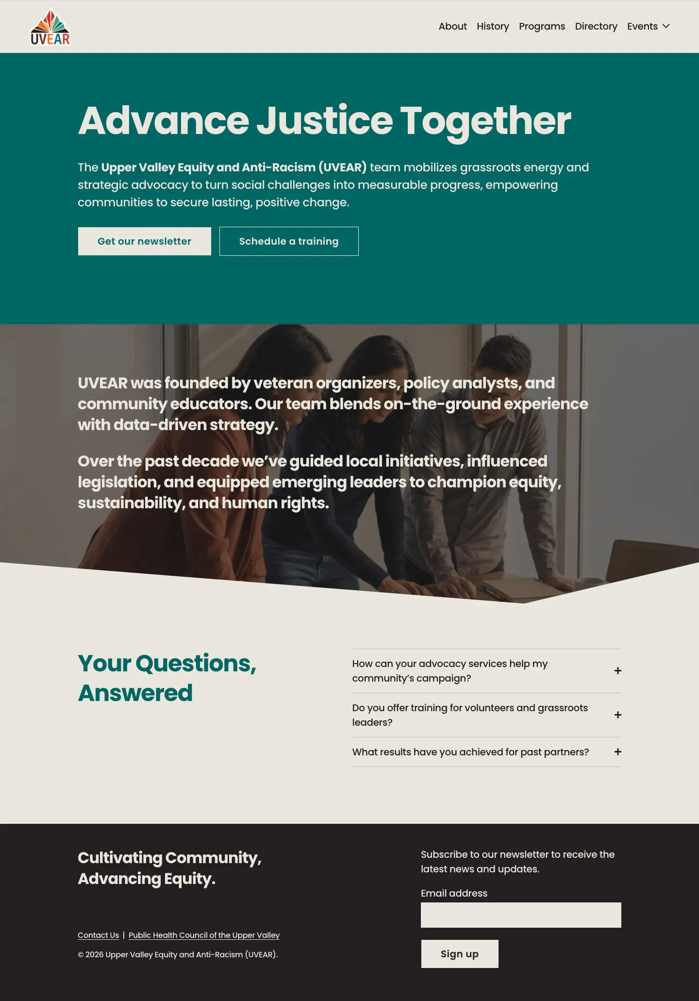
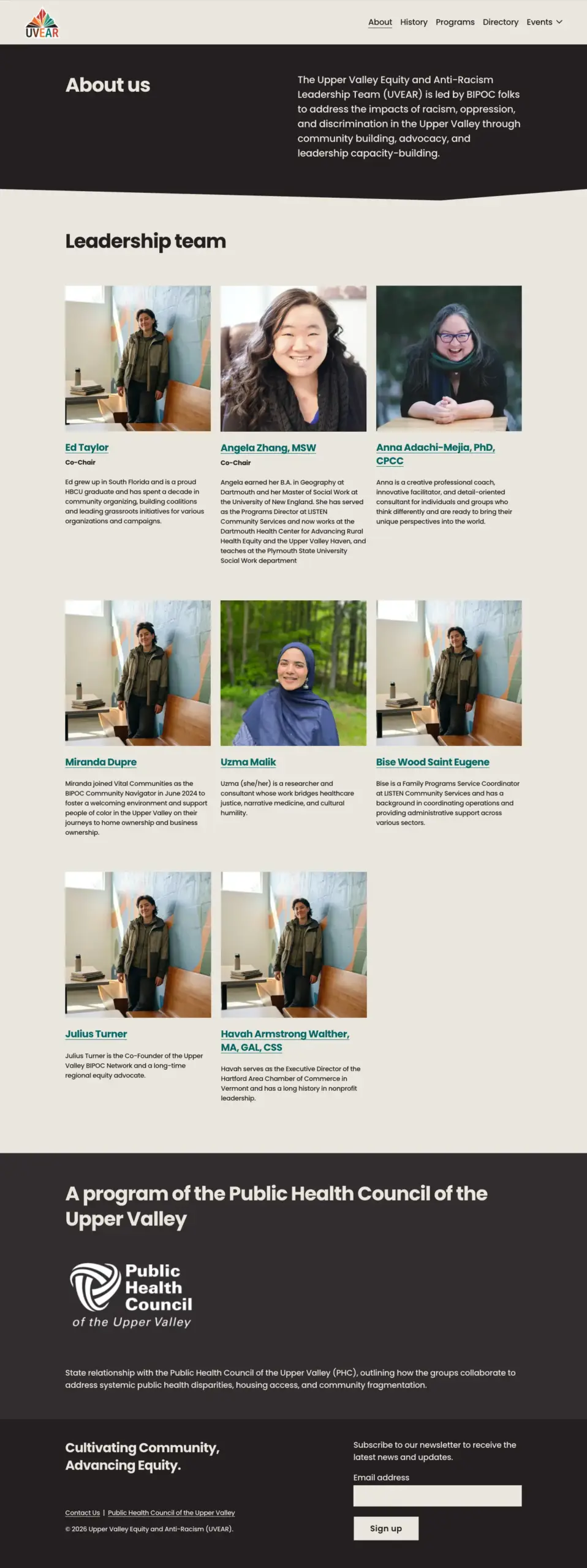
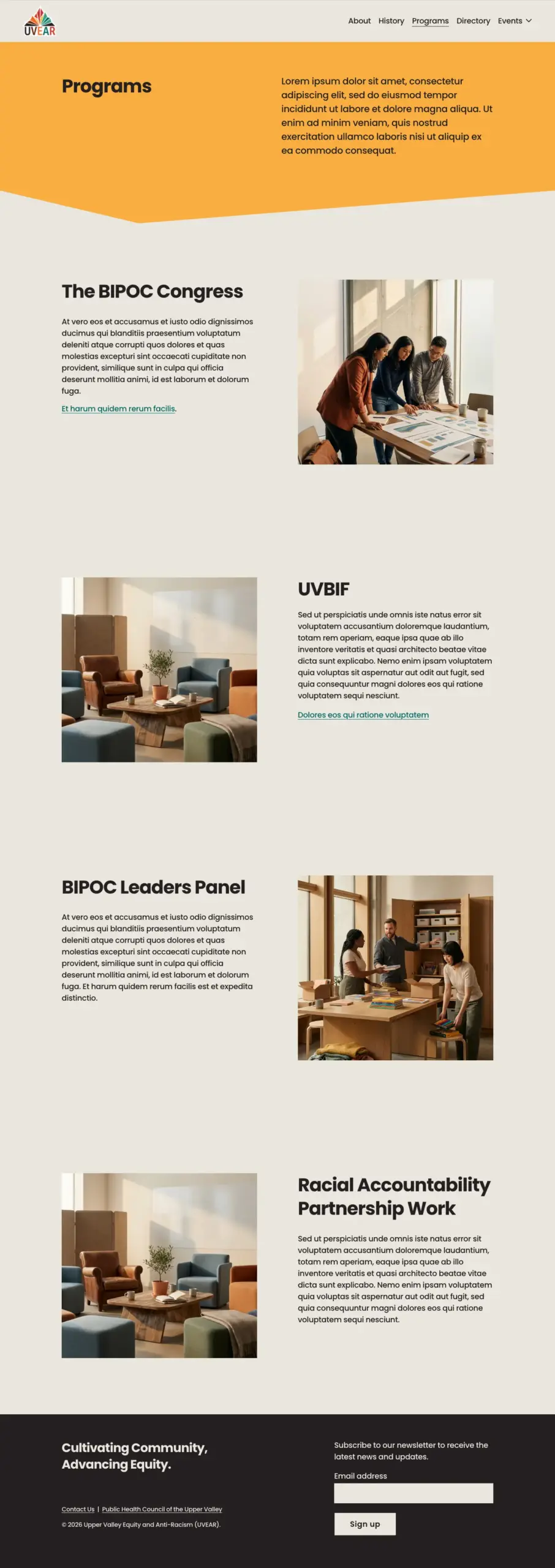
During the initial phase of work, some temporary images and content were used while UVEAR worked to gather resources. Updates will be made prior to final deployment of the site.
Highlights
Platform familiarity and maintainability
Squarespace was identified as leading choice among CMS platforms because it was familiar, provided easy management, and a solid design foundation for a reasonable cost. It was important that this small team with limited income could continue to release features and content without relying on external developers in a quick and predictable way.
Easy content management with Squarespace
Because a primary goal was long-term editing independence, the site was built using the standardized Squarespace page blocks and layout rules. Staff members can add announcements or new content, edit site sections, and post updates directly without risk of breaking page layouts. A few new templates and components were built, but we always worked within Squarespace’s constraints to make sure management stayed as simple as possible.
Designing for interactivity and visual identity
Interactive areas were designed with dedicated spaces for an embedded event calendar, a historical timeline, and a dynamic directory. The design incorporates custom visual accents—such as an angular section divider echoing the geometric motif of the UVEAR logo and tailored section background colors—to establish a distinct visual identity while keeping CTA pathways for newsletter sign-ups clear and accessible.
Hand-off and documentation strategy
To ensure a easier transition, many of our design decisions were captured and annotated so the team could follow along in Squarespace. This was meant to assist and transition what we learned over to the staff at UVEAR more easily so they could manage updates, post event details, and expand styles and content more easily without depending on the Design Allies team.
The results
The new digital hub significantly enhances UVEAR’s reach across rural New Hampshire and Vermont, turning community advocacy into measurable engagement.
A few things we learned:
- Test work constantly as you build across standard desktop, tablet, and mobile breakpoint. Something that looks great on desktop may not work so well on mobile, or vice versa.
- Squarespace uses a number of pre-set color section themes (Light 1, Dark 1, etc.). They prefer you map background colors to “Light” themes and darker colors to “Dark” themes. Using darker background fills on a “Light” theme can cause hard-to-read text issues or button color glitches across the site.
- Squarespace scales images automatically. However uploading larger file sizes can slow down loading times and harm mobile performance. We used tools like Squoosh and formats like WEBP.
- Limit the number of typefaces being used. We ended up sticking to just Poppins. More than can quickly dilute the design and slow down page load times.
- Squarespace excels at clean, structured, well spaced layouts. Work within those parameters. Balance complex interactive features like dynamic directories and timelines with simple, low-maintenance page administration for non-technical staff.